How to Create Custom Maps from Start to Finish
Learn how to create custom maps with this practical guide. We cover the best tools, data preparation, and design tips to build compelling maps today.
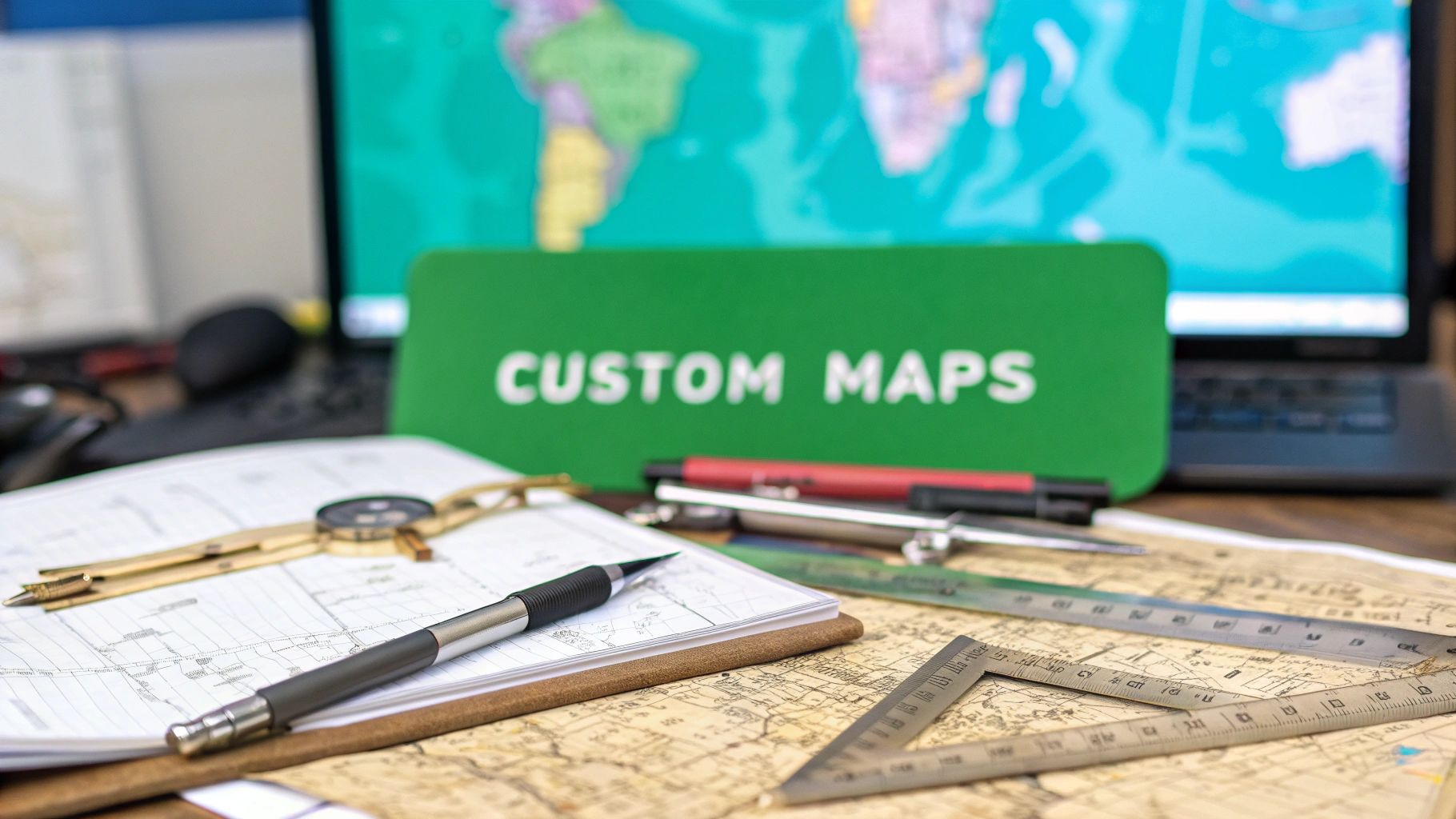
Knowing how to create custom maps is about more than just plotting points on a grid. It’s about transforming raw data into a visual story—picking the right tool, prepping your geographic info, and designing it all for maximum clarity.
This is how you can visualize everything from sales territories to environmental trends, turning dense datasets into insights you can actually use.
Why Custom Maps Are More Than Just Pins on a Board
Before we get into the "how," it's worth taking a moment to understand the "why." Custom maps are serious decision-making tools because they expose spatial patterns that spreadsheets and charts completely miss. They wrap your numbers in real-world context, turning an abstract list into a tangible narrative.
This shift from static data to dynamic visuals isn't just a neat trick; it's a booming field. The global digital map market was valued at USD 18.18 billion in 2022 and is on track to hit nearly USD 55 billion by 2030, all thanks to better mapping tech. If you're curious, you can explore more on the digital map market growth to see just how wide its applications are becoming.
Uncovering the Hidden Stories in Your Data
Think about a retail chain planning its next expansion. A simple list of potential cities is one thing, but a custom map that layers customer demographics, competitor locations, and local foot traffic data? That instantly pinpoints the perfect spot. The map tells a story that raw numbers just can't.
Or consider an environmental group tracking deforestation. A custom map showing forest loss over time makes their cause immediate and powerfully understandable to the public. These real-world examples show what custom mapping is really all about.
A great map isn't just a picture of your data; it's an argument. It persuades by presenting evidence in a clear, compelling, and visual format.
Key Benefits of Creating Your Own Maps
Moving beyond basic charts gives you some serious advantages that can sharpen your competitive edge or just make your message land with more impact.
- See Your Data Clearly: Spot trends, clusters, and outliers that are completely invisible in a spreadsheet.
- Make Smarter Decisions: Informed choices are easier when you understand the geographic context behind your information.
- Tell Engaging Stories: Grab your audience's attention with interactive and visually compelling narratives.
- Find Actionable Insights: Pinpoint specific opportunities or problem areas with geographic precision.
Finding the Right Tool for Your Mapping Project
Choosing the right software is the single most important decision you'll make when you set out to create a custom map. The best tool isn't the one with the most bells and whistles; it's the one that perfectly fits your project's complexity and your own comfort level with tech.
Think of it like picking a vehicle for a trip. You wouldn't take a high-performance race car on a rugged off-road trail, right? The same logic applies here.
Matching Tools to Your Ambition
For a simple weekend drive—say, plotting a few locations for a blog post or a family trip—a basic, user-friendly tool is all you need. This is where something like Google My Maps shines. It’s intuitive, web-based, and lets you create a simple map in minutes without a steep learning curve. It gets the job done, period.
But what if you're planning a complex, cross-country expedition? You'd want something more robust and powerful. For mapping projects that require deep design control, interactive elements for a website, or custom data layers, you need to step up to a professional-grade platform like Mapbox Studio. It's built for designers and developers who need to craft beautiful, dynamic maps.
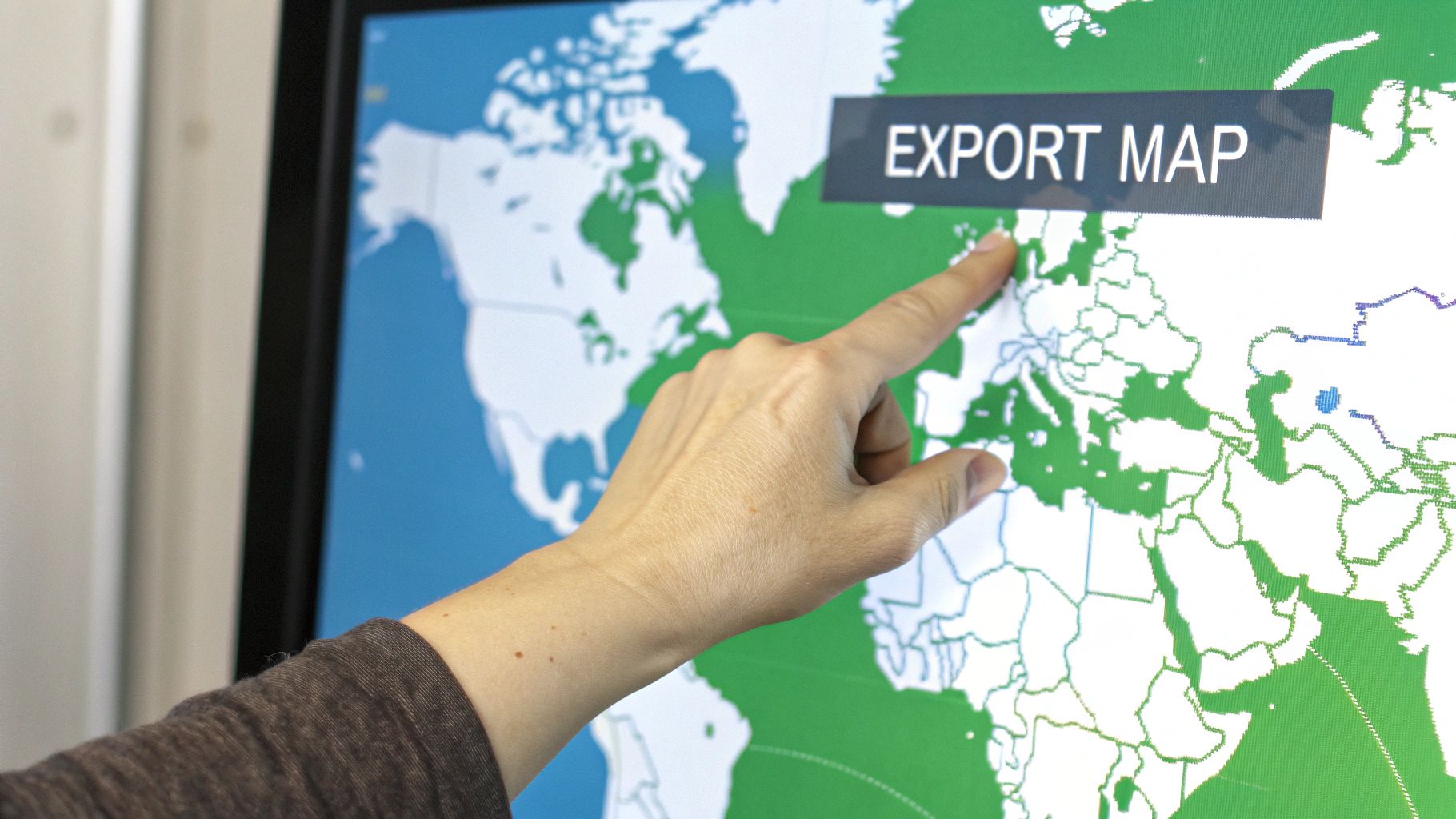
This infographic gives you a quick visual breakdown of the different tool categories, platforms, and file formats you’ll run into.
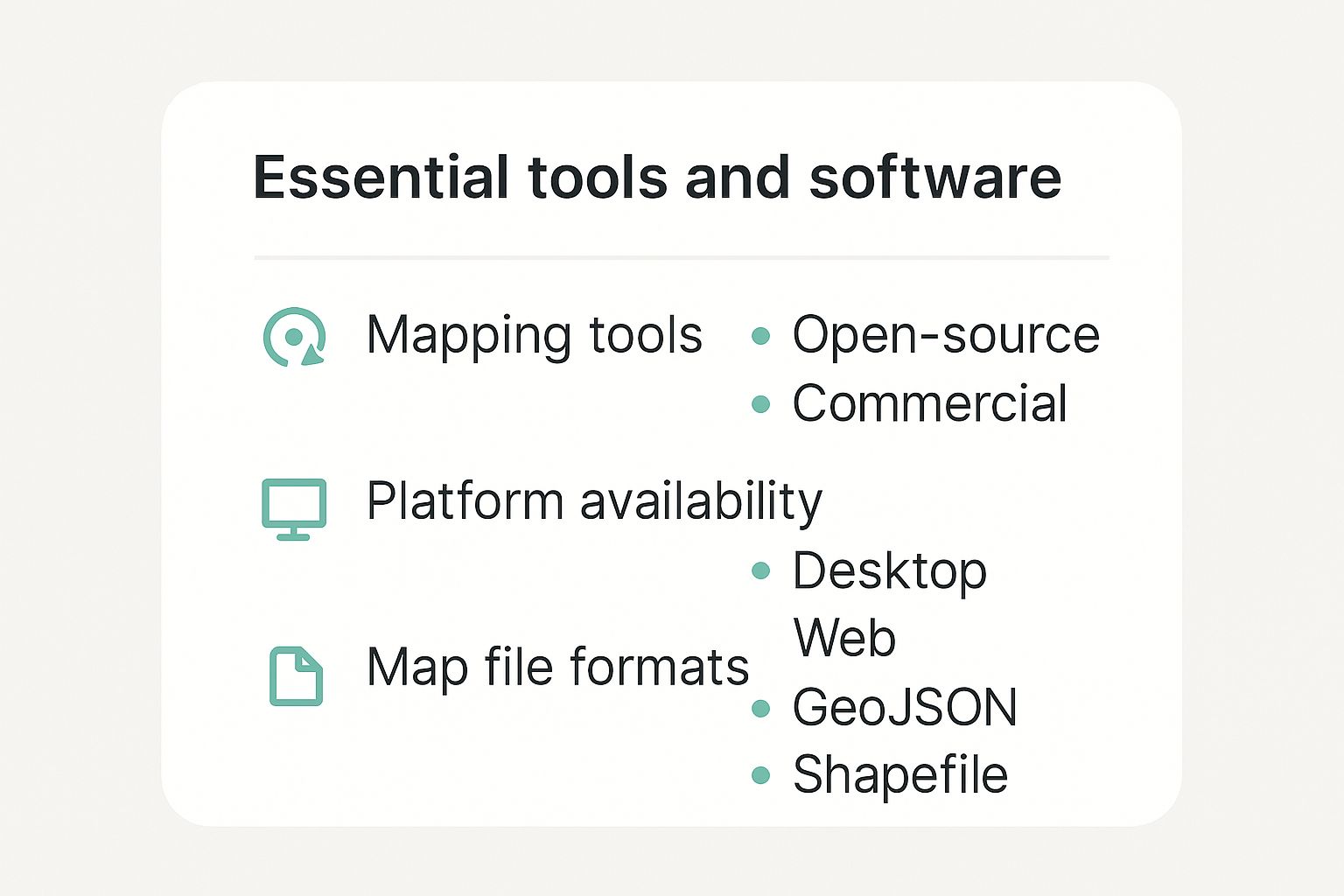
Understanding these differences is key. It helps you decide whether you need the raw power of desktop software or the convenience of a web app, or if an open-source tool is a better fit than a commercial one.
Then there are the projects that demand serious spatial analysis—like demographic studies, environmental modeling, or logistics planning. This is the all-terrain, heavy-duty vehicle of the mapping world. For this, you’ll turn to powerful, open-source GIS (Geographic Information System) software like QGIS. It offers unparalleled capabilities for data manipulation and analysis, but be warned: it comes with a much steeper learning curve.
The goal is to find the sweet spot between capability and usability. A powerful tool you can't figure out is less useful than a simple one you can master.
To help you decide, I've put together a quick comparison of some of the most popular options out there. This table should give you a good starting point for figuring out which platform aligns with your goals.
Comparison of Popular Custom Mapping Tools
| Tool Name | Best For | Key Features | Pricing Model |
|---|---|---|---|
| Google My Maps | Beginners, simple location plots, personal projects. | - Extremely easy to use - Basic styling options - Simple data import (spreadsheets) - Easy sharing | Free |
| Mapbox Studio | Web developers, designers, interactive web maps. | - Complete design control - Custom data visualization - APIs for web/mobile integration - High-performance maps | Freemium (generous free tier, then pay-as-you-go) |
| QGIS | Data analysts, researchers, GIS professionals. | - Advanced spatial analysis tools - Supports hundreds of data formats - Extensive plugin ecosystem - Full cartographic control | Free & Open Source |
| Felt | Collaborative teams, storytelling, annotations. | - Real-time collaboration - Easy-to-use drawing/annotation tools - Integrates various data sources - Great for presentations | Freemium (free for individuals, paid for teams) |
Each of these tools serves a different purpose, so there's no single "best" option—only the best option for your specific project.
To narrow it down, ask yourself these questions:
- Ease of Use: How quickly do I need to get this map made? Do I have time to learn a complex interface?
- Data Handling: What kind of data am I using? Can the tool import common file types like GeoJSON, KML, or Shapefiles?
- Customization: How much control do I need over the look and feel? Do I need custom fonts, colors, and icons?
- Cost: What’s my budget? Am I okay with a free tool with limitations, or do I need the power of a paid service?
By walking through these questions, you can move forward with confidence. If you're still exploring and want a great all-around option, check out this guide to a versatile custom map creator that hits a nice balance for many common projects.
Sourcing and Preparing Your Geographic Data
Any great map starts with great data. Before you even think about colors and fonts, you need a solid, clean foundation of geographic information. This is where the real work begins, and honestly, it’s the most critical part of the entire process.
Your data will usually fall into a couple of categories. You might have a list of points, which are just single locations like your store addresses or the coordinates of photo spots. Or, you could be working with polygons—shapes that define entire areas, like sales territories or neighborhood boundaries.
Finding Quality Geographic Datasets
The good news is you don't always have to build your dataset from scratch. There's a ton of high-quality, free geographic information out there if you know where to look. These are my go-to starting points for almost any project.
- Government Portals: Websites like the U.S. Census Bureau or your local city's data portal are goldmines for detailed demographic info and official boundary files.
- OpenStreetMap (OSM): This is a massive, collaborative open-source project. You can find incredibly detailed map data for the entire world, from road networks right down to individual building footprints.
- Academic and Public Repositories: Universities and research organizations often publish their geographic datasets for anyone to use.
Once you’ve found a promising dataset, the next step is where the magic really happens: cleaning it up. I know, it sounds tedious, but skipping this will absolutely come back to bite you with errors and a map that just doesn't work right.
I always tell people to expect that 80% of your mapping time will be spent preparing data, and only 20% will go into the fun design work. Get the prep work right, and everything else flows smoothly.
Cleaning and Standardizing Your Data
Most data you download won't be ready to map straight out of the box. You'll need to open it up in a spreadsheet program and hunt for common issues. I'm talking about things like inconsistent formatting, typos in city names, or empty cells where location data should be.
For example, make sure all your country names are the same—is it "USA," "U.S.A.," or "United States"? Pick one and stick with it. Check that your coordinate columns are in a consistent numerical format.
If you’re juggling different coordinate systems, our handy coordinate converter tool can help standardize everything into a single format like decimal degrees, which is what most mapping software prefers. Spending a little extra time meticulously cleaning your data now will save you a world of headaches later and ensure your final map is accurate and professional.
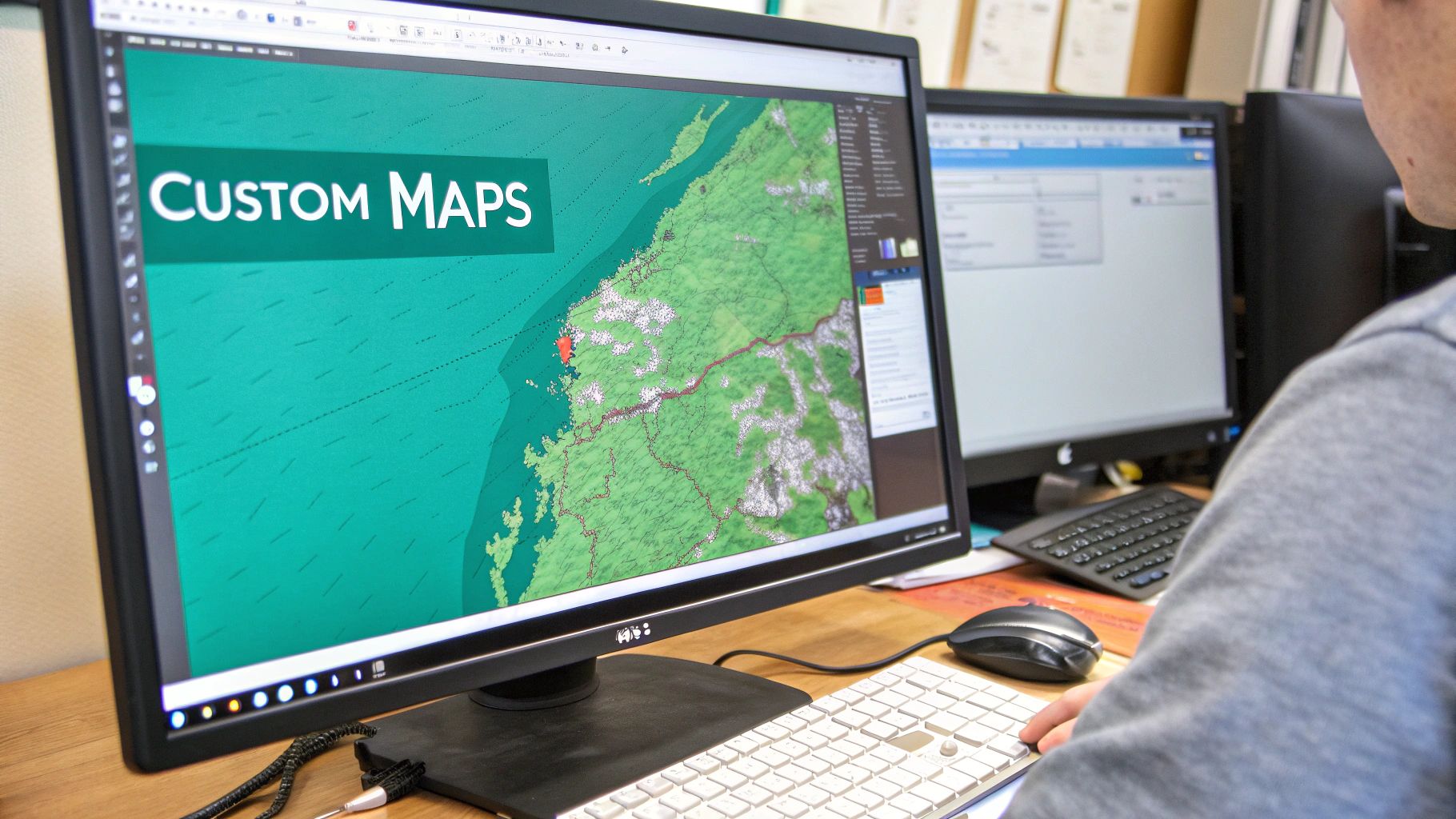
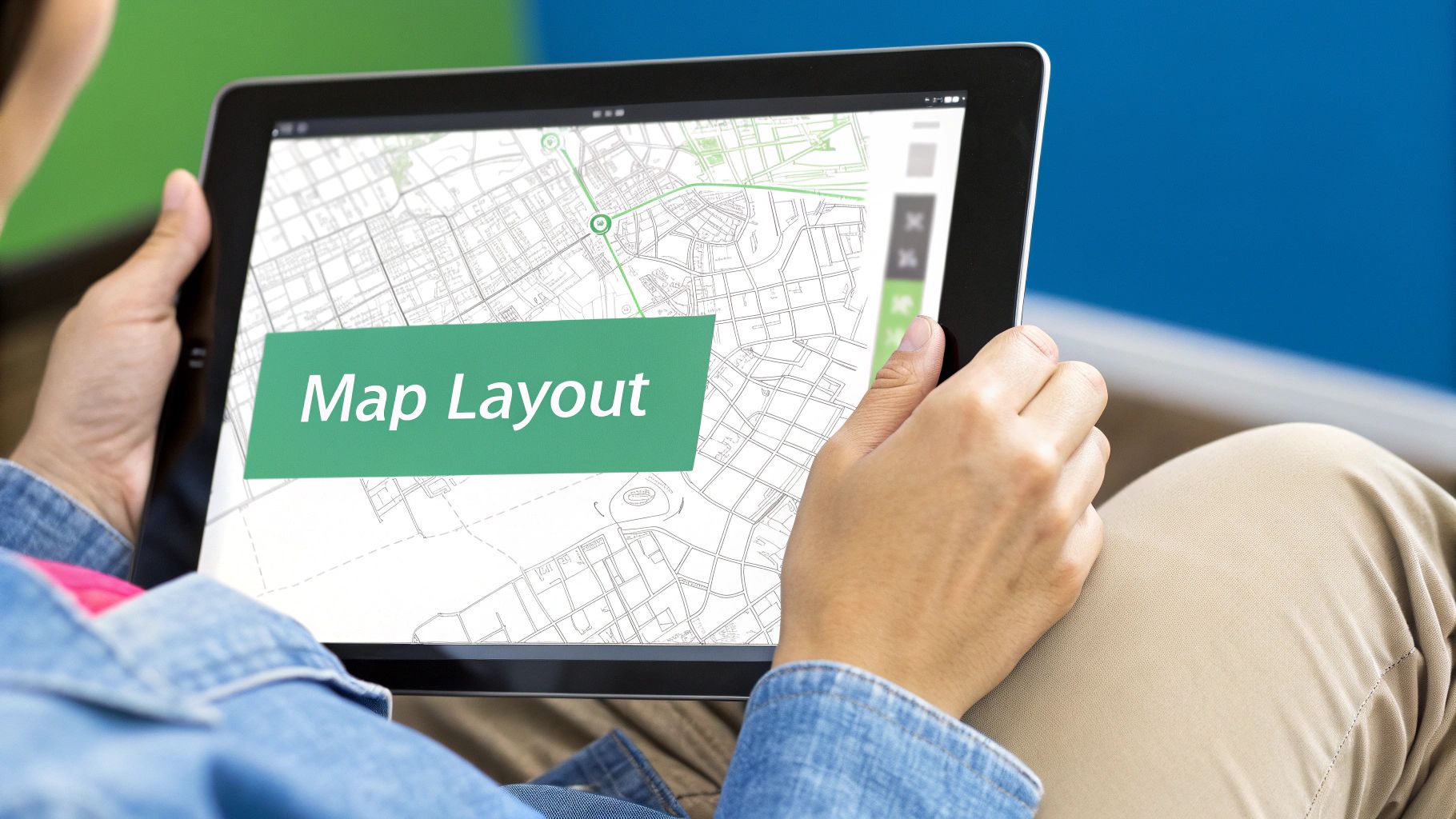
Designing Your Map for Maximum Clarity and Impact
Now for the fun part. You’ve got your data cleaned up and ready to go, and it’s time to bring it to life with design. This is where you get to turn rows of boring spreadsheet data into a visual story that actually means something to people.
Good map design isn't about making a pretty picture—it's about making smart choices. The goal is to guide your viewer's attention and make your main point obvious at a glance.
Starting with the Right Foundation: Your Base Map
Everything starts with the base map. Think of it as the canvas you’re painting on. The right choice here makes a huge difference.
Are you mapping out hiking trails? A busy, detailed satellite view might be perfect. But if you’re showing sales territories across a state, that same satellite view would just be distracting noise. For most data-heavy maps, a simple, light-gray base map works best because it lets your colorful data points pop.
Choosing Colors and Symbols That Tell a Story
Color is easily one of the most powerful tools you have. It can instantly signal what’s important and reveal patterns without a single word of explanation. Don't just pick colors that look nice; pick colors that make sense.
- A sequential color scheme is perfect for showing numerical data, like population density or sales figures. It uses shades of a single color, from light to dark, to show a clear progression from low to high values.
- A diverging scheme uses two contrasting colors to show data that splits from a central value. This is great for visualizing things like above-average and below-average income across different neighborhoods.
Your goal is clarity, not a rainbow. A limited, thoughtful color palette is almost always more effective than throwing a dozen different colors on the map. Stick to colorblind-friendly schemes to make sure everyone can understand your story.
Symbols and icons are just as important. If you’re plotting different types of businesses, use icons that people instantly recognize—a shopping cart for retail stores, a coffee cup for cafes. This kind of visual shortcut makes your map so much easier to understand.
Finally, you have to wrangle your labels. Nothing makes a map look messy faster than a bunch of overlapping, unreadable text. Most mapping tools have features that automatically shift labels around to avoid collisions. Use them! A clean map is a readable map.
Adding Interactivity and Sharing Your Map with the World
A beautiful map is great, but an interactive one is unforgettable. This is the final and most crucial step—turning your static image into a living, breathing experience that people can actually engage with. It's the moment your audience leans in and starts exploring the data for themselves.
Adding a few interactive elements can completely transform a map from a passive picture into an active tool.
- Clickable Pop-ups: Let people click on any point or region to get more details, like a specific store's hours or a neighborhood's demographic stats.
- Toggleable Layers: Give your audience the power to turn different data layers on and off. This is fantastic for showing how various factors relate to one another.
- User-Controlled Filters: Empower viewers to narrow down the data based on what they care about, like filtering a real estate map by price range or number of bedrooms.
Making Your Map Public
Once you’ve built this amazing interactive tool, it’s time to get it in front of people. Thankfully, modern mapping platforms make this incredibly straightforward.
The industry has overwhelmingly shifted to the cloud, which now holds a 65.7% share of the digital map market. For us, this means we can easily share and scale our creations without ever worrying about servers or hosting. You can dig into the specifics by exploring the full digital map market analysis.
Most platforms give you a few solid options for sharing your work.
Your Sharing Playbook
- Generate a Shareable Link: This is the easiest way. Just create a direct URL that you can email, text, or post on social media to send people right to your interactive map.
- Get an Embed Code: Want the map to live right inside your blog post or on a webpage? Copy a small snippet of HTML, paste it into your site, and you’re good to go.
- Export a High-Quality Image: Sometimes you just need a static image for a report, presentation, or print. Most tools let you export a high-resolution PNG or PDF.
Pro Tip: Always, always test your embedded map on a phone. A map that looks incredible on a desktop but is a jumbled mess on mobile isn't going to help anyone.
By getting comfortable with these options, you ensure all your hard work gets seen. Whether you’re showing off global sales data or creating a fun resource like this interactive map of world capitals, getting your map out there is the ultimate payoff.
Taking Your Maps to the Next Level
So you've got the basics down. You can prep your data, style your map, and share it. Now it's time to dive into the more powerful techniques the pros use to turn a simple map into a dynamic, indispensable tool for analysis and storytelling.
These aren't just fancy add-ons; they unlock entirely new ways to visualize and interact with your location data.
From Addresses to Dots on a Map: The Magic of Geocoding
One of the first hurdles you'll hit with any large dataset is turning a long list of street addresses into actual points on a map. This process is called geocoding, and it's fundamental.
Instead of manually looking up latitude and longitude coordinates for hundreds or thousands of locations (a truly soul-crushing task), you can use a geocoding service. It automates the entire process, saving you a massive amount of time while ensuring your points are plotted with precision. It’s a total game-changer.
Connecting to Live Data Sources
Here's where things get really exciting. You can connect your custom maps to live data feeds using APIs (Application Programming Interfaces). This allows your map to update itself automatically as new information rolls in, creating a truly dynamic experience.
Think about it. A map that doesn't just show your store locations, but also pulls real-time inventory data from your company's internal systems. Or a map for a music festival that displays live social media posts geotagged to the venue. This is how you create maps that are always current and incredibly useful.
Connecting your map to live data sources transforms it from a static snapshot into a living dashboard. It’s the difference between looking at a photograph of a river and watching the river flow in real time.
This move toward dynamic, data-rich maps is a big deal. In fact, the market for custom digital map services is projected to balloon into an $8 billion market by 2025. It's expected to keep growing at a compound annual growth rate of around 15% through 2033, largely driven by logistics and business analytics. You can learn more about the custom map service market to get a feel for the trends.
Embracing Three-Dimensional Visualization
For maximum impact, sometimes you need to break out of the flat, two-dimensional world. Creating 3D visualizations adds a layer of depth and perspective that can make complex data instantly understandable.
For instance, you could represent building heights in a city model or show population density as extruded polygons that rise up from the map. This approach is incredibly powerful for urban planning, real estate, and environmental analysis because it offers a much more immersive and intuitive view of your data.
Ready to explore the world in a whole new way? With EarthChasers, you can turn your passion for geography into an exciting adventure. Discover new places, challenge your friends, and build your own maps in our immersive 3D game. Start your journey today at https://earthchasers.com.