10 Projections That Create an Alternative Map of the World
Explore a fascinating alternative map of the world with 10 different projections. Understand the distortions and benefits beyond the standard Mercator view.
The image of the world map hanging in your childhood classroom is almost certainly wrong. It’s a distorted view of reality, a necessary compromise made to flatten a three-dimensional globe onto a two-dimensional surface. This process, known as map projection, inevitably sacrifices accuracy in shape, area, distance, or direction. The familiar Mercator projection, for example, dramatically inflates the size of landmasses nearer the poles, making Greenland appear as large as Africa, when in reality, Africa is 14 times larger.
This isn't just a quirky cartographic fact; it shapes our perception of the world, influencing our understanding of global importance and scale. This article explores a curated set of ten alternative map of the world projections, each offering a unique and often more accurate perspective. You'll discover maps that preserve true land area, others that offer radical new viewpoints, and some designed for specific navigational or scientific purposes.
By examining these different projections, from the equal-area Gall-Peters to the futuristic AuthaGraph, you will gain a more nuanced and accurate mental model of our planet. This list is a practical guide to deconstructing your geographical biases and seeing the Earth as it truly is: a complex, interconnected sphere.
1. The Gall-Peters Projection: A Focus on Equal Area
The Gall-Peters Projection stands as one of the most famous examples of an alternative map of the world. Developed by James Gall in 1855 and popularized by Arno Peters in the 1970s, its primary goal is to present all landmasses with accurate, equal area representation.
This map directly challenges the ubiquitous Mercator projection, which severely distorts the size of countries farther from the equator. On a Mercator map, Greenland appears as large as Africa, yet in reality, Africa is 14 times larger. The Gall-Peters projection corrects this by elongating countries near the equator and squashing those near the poles to maintain their true proportional size.
Strategic Analysis
The map's strategic power lies in its political and social implications. By showcasing the true scale of continents like Africa and South America, it reframes global perspectives, challenging the perceived dominance of Northern Hemisphere countries often exaggerated by Mercator-based maps. This makes it a powerful tool in educational and political contexts for fostering a more balanced worldview.
Actionable Takeaways
- For Educators: Use the Gall-Peters projection alongside the Mercator to teach students about map distortion and its historical impact. It’s a perfect visual aid for discussions on post-colonialism and global equality.
- For Content Creators: When creating infographics or presentations on global data (like population or resource distribution), using an equal-area projection like Gall-Peters ensures your visual representation is accurate and not misleading.
2. The Gall-Peters Projection: A Focus on Equal Area
The Gall-Peters Projection stands as one of the most famous examples of an alternative map of the world. Developed by James Gall in 1855 and popularized by Arno Peters in the 1970s, its primary goal is to present all landmasses with accurate, equal area representation.
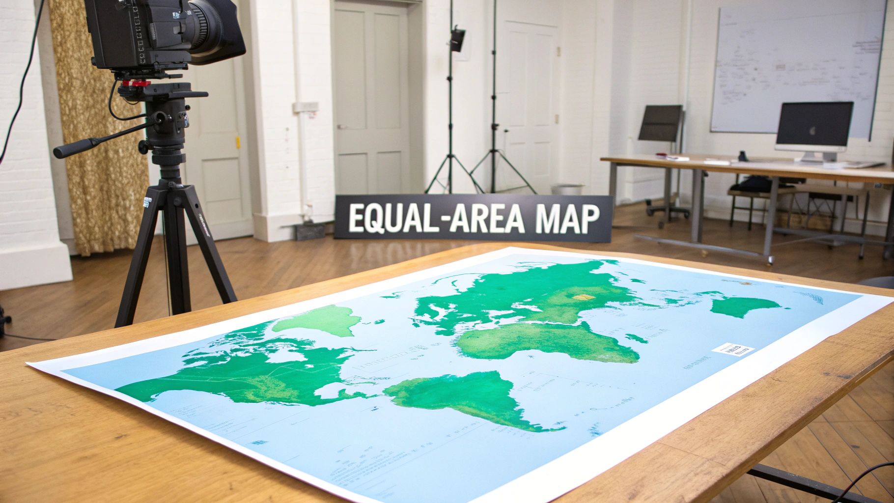
This map directly challenges the ubiquitous Mercator projection, which severely distorts the size of countries farther from the equator. On a Mercator map, Greenland appears as large as Africa, yet in reality, Africa is 14 times larger. The Gall-Peters projection corrects this by elongating countries near the equator and squashing those near the poles to maintain their true proportional size.
Strategic Analysis
The map's strategic power lies in its political and social implications. By showcasing the true scale of continents like Africa and South America, it reframes global perspectives, challenging the perceived dominance of Northern Hemisphere countries often exaggerated by Mercator-based maps. This makes it a powerful tool for organizations like the United Nations and social justice groups to foster a more balanced worldview.
Actionable Takeaways
- For Educators: Use the Gall-Peters projection alongside the Mercator to teach students about map distortion and its historical impact. It’s a perfect visual aid for discussions on post-colonialism and global equality.
- For Content Creators: When creating infographics or presentations on global data (like population or resource distribution), using an equal-area projection like Gall-Peters ensures your visual representation is accurate and not misleading.
3. The Robinson Projection: A Compromise for Visual Balance
The Robinson Projection is a well-known alternative map of the world designed to offer a visually appealing and balanced representation of the globe. Developed by Arthur H. Robinson in 1963, its key feature is that it is a "compromise" projection; it is neither equal-area nor conformal (shape-preserving).
Instead of perfecting one property, Robinson intentionally allowed for minor distortions in shape, area, distance, and direction across the entire map. The result is a more natural-looking world with gently curving meridians and less extreme distortion near the poles compared to the Mercator. This aesthetic and functional compromise made it the projection of choice for the National Geographic Society from 1988 to 1998 and a staple in countless classrooms and atlases.
Strategic Analysis
The strategic value of the Robinson Projection lies in its accessibility and educational utility. By prioritizing aesthetics and overall balance, it creates a world map that feels intuitive and less politically charged than either the Mercator or Gall-Peters. It serves as an excellent general-purpose map, providing a good sense of the world's geography without overwhelming viewers with the severe distortions of other projections. Its widespread use in educational materials has shaped the geographical understanding of generations.
Actionable Takeaways
- For Educators: Use the Robinson projection as a foundational map in introductory geography courses. Its balanced view is ideal for teaching about continents, oceans, and general climate zones without getting bogged down in complex distortion debates.
- For General Reference: When you need a world map for a presentation, report, or wall display where visual appeal is as important as general accuracy, the Robinson is an excellent choice. It presents a familiar and non-controversial depiction of the world.
4. The Mollweide Projection: An Ellipse of Global Data
The Mollweide Projection offers another compelling alternative map of the world, presenting the entire globe within a distinctive elliptical shape. Created by mathematician Karl B. Mollweide in 1805, this pseudocylindrical projection is renowned for its equal-area property, ensuring that all landmasses are depicted in their correct proportional size.
Unlike the rectangular Gall-Peters, Mollweide's ellipse significantly reduces shape distortion in the central regions, although distortion increases toward the outer edges. Its curved meridians and straight parallels make it a preferred choice for thematic maps illustrating global distributions, such as climate patterns, population density, or cosmic background radiation, where accurate area representation is critical for analysis.
Strategic Analysis
The strategic advantage of the Mollweide projection is its balance between preserving area and presenting a visually coherent global image. The elliptical frame is less politically charged than rectangular projections and is often perceived as more "natural" or globe-like. This makes it an ideal tool for scientific and educational contexts where the primary goal is to display data patterns across the planet without the dramatic shape contortions seen in some other equal-area maps.
Actionable Takeaways
- For Data Scientists: When visualizing global datasets like environmental or demographic data, use the Mollweide projection to ensure your audience can make accurate area-based comparisons between different regions. It avoids the misleading size cues of Mercator.
- For Publishers & Researchers: Employ this projection in scientific journals or textbooks for global distribution maps. Its widespread use in academia lends credibility and provides a familiar, standardized format for presenting worldwide phenomena.
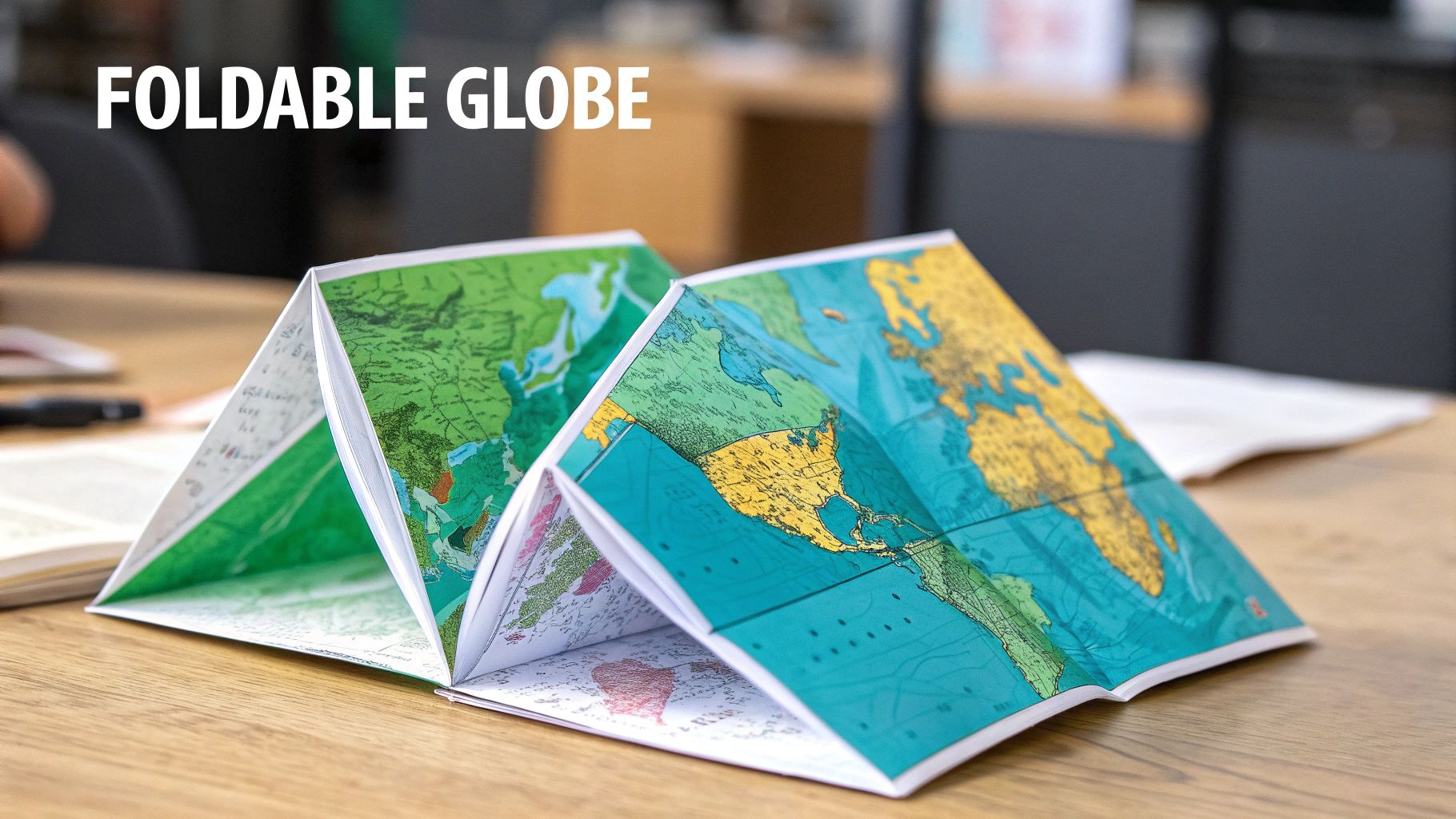
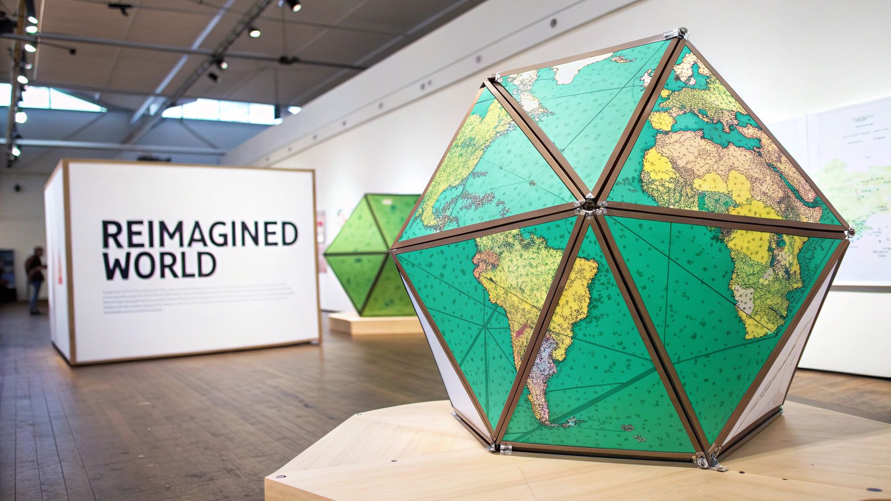
5. The AuthaGraph Projection: Folding the World Accurately
The AuthaGraph Projection is a truly innovative alternative map of the world, offering one of the most proportionally accurate 2D representations ever created. Developed by Japanese architect Hajime Narukawa in 1999, it masterfully transfers the Earth's spherical surface onto a flat rectangle by dividing it into 96 equal triangles.
This method allows the map to be seamlessly tiled in any direction and folded from a flat sheet into a three-dimensional globe without gaps or overlaps. By preserving the relative sizes of all landmasses and oceans, it corrects distortions found in nearly every other projection, earning it Japan's prestigious Good Design Grand Award.
Strategic Analysis
The strategic genius of the AuthaGraph lies in its ability to present a holistic and continuous view of the world. Unlike maps that break apart oceans or continents at the edges, AuthaGraph can be re-centered on any point, providing a fluid perspective of global relationships, from airline routes to ocean currents. This makes it an unparalleled tool for visualizing interconnected global systems without the arbitrary east-west divide. Its design fundamentally shifts how we perceive planetary dynamics.
Actionable Takeaways
- For Geographers and Researchers: Use AuthaGraph to model global phenomena like climate change or tectonic plate movements. Its continuous, equal-area surface provides a more accurate canvas for plotting data that spans across traditional map boundaries.
- For Educators: The physical, foldable nature of the AuthaGraph map is a powerful hands-on tool. Use it to teach students the complex relationship between a 2D map and a 3D globe, demonstrating the challenges of projection in a tangible way.
Embedded content
For those interested in exploring cartographic design further, you can get insights on how to create your own custom maps.
6. The Azimuthal Equidistant Projection: A Focus on True Distance
The Azimuthal Equidistant Projection offers a unique and highly functional alternative map of the world by prioritizing true distance and direction from a single central point. Unlike projections that preserve area or shape, this map’s defining feature is that any straight line drawn from the center to any other point represents the shortest distance on Earth's surface.
This radial perspective warps the shapes and sizes of landmasses, especially those far from the chosen center. A famous example is the emblem of the United Nations, which uses a polar Azimuthal Equidistant projection centered on the North Pole. It’s also commonly used by airlines to display flight routes from a hub city, as it accurately depicts travel distances and paths.
Strategic Analysis
The strategic value of this projection is its unparalleled utility for logistical and range-based analysis. For any application where distance from a central point is the most critical variable, this map is superior. Military planners use it to calculate missile ranges, and emergency services use it to visualize the radius of an incident's impact. It transforms the world map from a general geographic reference into a precise tool for distance-centric planning.
Actionable Takeaways
- For Analysts: When mapping distribution networks, radio transmission ranges, or seismic wave propagation, center the projection on your point of origin. This immediately provides a clear, intuitive visual of all locations at their true distance.
- For Gamers & World-Builders: Use this projection to create realistic maps centered on a capital city or key location in your fictional world. It helps in planning travel times, trade routes, or the reach of a magical effect with accurate radial distance.
7. Goode's Homolosine Projection: The "Orange Peel" Map
Goode's Homolosine Projection is a distinctive alternative map of the world designed to prioritize the accuracy of landmass shapes and sizes. Created by John Paul Goode in 1923, this equal-area composite map famously interrupts the oceans, creating gores or flaps that make it resemble a flattened orange peel.
The design is a hybrid, using the Sinusoidal projection for the equatorial regions and the Mollweide projection for higher latitudes. By splitting the map along oceanic meridians, it dramatically reduces the distortion of major continents. This makes it an exceptional tool for displaying phenomena that occur primarily on land, as seen for decades in publications like Goode's World Atlas.
Strategic Analysis
The strategic genius of the Homolosine projection is its deliberate sacrifice of oceanic continuity to achieve unparalleled terrestrial accuracy. By "interrupting" the oceans, it solves the fundamental problem of flattening a sphere: it minimizes the stretching and shearing of continents that plague other projections. This makes it a scientifically honest map for land-based data, prioritizing geographical integrity over the aesthetic neatness of a continuous rectangular map.
Actionable Takeaways
- For Researchers: When mapping terrestrial data like species distribution, agricultural patterns, or cultural zones, use the Homolosine projection. Its equal-area property and low-distortion continents ensure your spatial analysis is accurate and your visual comparisons are valid.
- For Educators: This projection is an excellent resource for teaching students about the trade-offs in mapmaking. Compare it to a Mercator or Robinson projection to visually demonstrate how prioritizing one feature (like land shape) requires sacrificing another (like ocean continuity).
8. Web Mercator (EPSG:3857): The Digital Standard
The Web Mercator projection is arguably the most viewed alternative map of the world, even if most users don't know its name. As the standard for virtually all major web mapping services like Google Maps and OpenStreetMap, it is a slight variation of the traditional Mercator projection, specifically optimized for digital screens and computational speed.
It simplifies calculations by treating the Earth as a perfect sphere rather than a more complex ellipsoid. This allows for fast, seamless zooming and panning, which is crucial for interactive online maps. While it inherits the Mercator’s infamous area distortions-exaggerating regions near the poles-its performance benefits made it the de facto standard for online navigation and location-based services.
Strategic Analysis
The strategic genius of Web Mercator lies in its prioritization of user experience over cartographic accuracy. For its primary purpose-online navigation and quick reference-the convenience of a square map that aligns with a grid system is paramount. The system's integration into web development frameworks made it incredibly easy for developers to build powerful mapping applications, cementing its dominance in the digital age. Learn more about the technology behind these systems in our guide to Geographic Information Systems on earthchasers.com.
Actionable Takeaways
- For Web Developers: When building interactive maps for navigation or local points of interest, Web Mercator (EPSG:3857) is the go-to choice due to its vast library support (like Leaflet.js and Mapbox) and performance.
- For Analysts: Avoid using Web Mercator for any scientific or statistical analysis where area accuracy is important. Always reproject data to an equal-area projection before performing spatial calculations to prevent skewed results.
9. Dymaxion Map (Fuller Projection)
Invented by the visionary architect and systems theorist R. Buckminster Fuller, the Dymaxion map is a truly radical alternative map of the world. Patented in 1946, it projects the globe onto the surface of an icosahedron (a 20-sided shape), which can be unfolded and flattened into a two-dimensional net. This design presents the Earth’s landmasses as one continuous "island" in a single ocean.
The map’s most significant feature is its minimal distortion of the relative size and shape of land areas. Unlike traditional projections, it has no "up" or "down" and avoids splitting continents, challenging our inherent biases about the globe. Its ability to be reconfigured allows viewers to see novel connections and patterns in global data, such as human migration or resource distribution.
Strategic Analysis
The Dymaxion map’s strategic value lies in its power to disrupt conventional thinking. By removing the familiar grid of latitude and longitude and presenting continents contiguously, it encourages a holistic, systems-based perspective of our planet. It forces the viewer to abandon preconceived notions of north-south hierarchy and national separation, making it an exceptional tool for conceptual and philosophical discussions about global interconnectedness and shared resources.
Actionable Takeaways
- For Systems Thinkers: Use the Dymaxion map to visualize global systems like climate patterns, supply chains, or internet connectivity without the artificial breaks imposed by other projections. It helps illustrate the "one-island" nature of the global community.
- For Innovators and Designers: Print and construct a physical icosahedral model to use in workshops. This hands-on tool can stimulate creative problem-solving by literally allowing participants to reframe their perspective on global challenges.
10. The Waterman Butterfly Projection: An Artistic Arrangement
The Waterman Butterfly Projection is a visually striking alternative map of the world that prioritizes both aesthetic form and cartographic integrity. Developed by Steve Waterman in 1996, this map projects the globe onto a truncated octahedron, which is then unfolded into its iconic butterfly shape. This method significantly reduces overall distortion compared to many other projections.
Its unique design arranges the continents into a cohesive, almost uninterrupted landmass, presenting a unique perspective on global connectivity. By cleverly "hiding" most of the Pacific Ocean in the cutout gaps, it emphasizes the terrestrial world. This combination of low distortion and artistic presentation makes it a favorite in design, educational, and cartography communities for its novel approach to representing our planet.
Strategic Analysis
The map's strategic value lies in its ability to challenge conventional map aesthetics while maintaining high fidelity. It forces the viewer to reconsider the very shape of a world map, breaking the rectangular mold that dominates our thinking. By presenting the world in such an unusual but mathematically sound form, it serves as an excellent educational tool for demonstrating that there are countless ways to accurately map the earth's surface.
Actionable Takeaways
- For Educators: Use the Waterman Butterfly map to introduce the concept of polyhedral projections. Its tactile, foldable nature makes it perfect for creating physical models that help students understand how a 3D globe is translated onto a 2D surface.
- For Designers: This projection is ideal for artistic installations or conceptual presentations where visual impact is paramount. Its elegant shape can serve as a compelling centerpiece for projects focused on global themes, environmental connectivity, or innovative data visualization.
Comparison of 10 World Map Projections
| Projection | 🔄 Implementation complexity | ⚡ Resource / support | 📊 Expected outcomes | 💡 Ideal use cases | ⭐ Key advantages |
|---|---|---|---|---|---|
| Mercator Projection | 🔄 Low — simple cylindrical math | ⚡ Very high — ubiquitous nautical/web tooling | 📊 Preserves angles/directions; large area distortion near poles | 💡 Marine navigation, web maps, compass-based routing | ⭐ Excellent angle preservation; straight rhumb lines |
| Gall-Peters Projection | 🔄 Low — equal-area cylindrical transform | ⚡ Moderate — available in GIS, less common in web tiles | 📊 True relative area; notable shape stretching near equator | 💡 Area comparisons, education, social/political maps | ⭐ Accurate area representation; counters size bias |
| Robinson Projection | 🔄 Medium — compromise formulas/lookup tables | ⚡ Good — common in atlases and GIS | 📊 Visually balanced global view; moderate, even distortion | 💡 General reference, education, thematic atlases | ⭐ Aesthetically pleasing compromise; readable world map |
| Mollweide Projection | 🔄 Medium — equal-area pseudocylindrical math | ⚡ Moderate — used in scientific/GIS contexts | 📊 Accurate area for global distributions; elliptical outline with edge distortion | 💡 Climate, population and thematic scientific maps | ⭐ Equal-area; effective for distribution mapping |
| AuthaGraph Projection | 🔄 High — triangle-based geodesic construction | ⚡ Limited — niche software and manual fold demos | 📊 Very low overall distortion; foldable to a globe; unfamiliar layout | 💡 High-accuracy exhibits, advanced teaching, museum displays | ⭐ Among most accurate; globe-foldable without gaps |
| Azimuthal Equidistant Projection | 🔄 Low–Medium — center-based formulas | ⚡ High for single-center uses | 📊 True distances/directions from chosen center; severe distortion away from center | 💡 Hub-distance analysis, emergency planning, route/range maps | ⭐ Preserves true distance and bearing from center |
| Goode's Homolosine Projection | 🔄 Medium–High — interrupted composite construction | ⚡ Moderate — GIS support but custom interruptions | 📊 Equal-area with minimized land distortion; oceans discontinuous | 💡 Biogeography, land-focused thematic mapping, education | ⭐ Minimizes land distortion; equal-area for continents |
| Web Mercator (EPSG:3857) | 🔄 Low — spherical Mercator simplification | ⚡ Very high — de facto web-mapping standard | 📊 Fast, seamless tiled maps; inherits Mercator area distortions | 💡 Online slippy maps, web navigation, interactive mapping UIs | ⭐ Fast rendering and broad platform compatibility |
| Dymaxion (Fuller Projection) | 🔄 High — icosahedral unfolding and arrangement | ⚡ Limited — specialized tools and explanation needed | 📊 Low overall distortion; unconventional, rearrangeable layout | 💡 Conceptual education, exhibitions, systems-thinking demonstrations | ⭐ Minimal distortion; novel geometric perspective |
| Waterman Butterfly Map | 🔄 High — octahedral unfolding with custom layout | ⚡ Limited — niche implementations and tooling | 📊 Moderate–low total distortion; butterfly-shaped emphasis on land | 💡 Artistic installations, alternative cartography education, museums | ⭐ Visually distinctive; emphasizes continents and habitability |
Choosing Your Worldview: A Cartographer's Final Thought
Our journey through the diverse landscape of cartography reveals a profound truth: a map is never just a map. It is a story, a perspective, and a powerful tool that shapes our understanding of the world. From the familiar, distorted coastlines of the Mercator to the mind-bending, continent-preserving facets of the Dymaxion, each projection offers a unique lens through which to view our planet. We've seen how a simple choice in cartographic design can either reinforce colonial biases or champion global equality.
The critical takeaway is that there is no single "correct" map. The familiar classroom map, the Web Mercator, serves its purpose for navigation but fails spectacularly at representing the true scale of continents, inadvertently diminishing the perceived importance of regions near the equator. This exploration of each alternative map of the world has equipped you with the critical thinking needed to question the images you are presented with daily.
Synthesizing Your Cartographic Insights
Let's distill the core lessons from our analysis of these world projections:
- Purpose Dictates Design: The best map is the one that best suits its intended function. The Azimuthal Equidistant is perfect for calculating flight paths from a central point, while the Goode Homolosine excels at showing the distribution of landmasses without a single, dominant center.
- All Maps Compromise: The act of translating a 3D sphere onto a 2D plane necessitates distortion. A map can preserve area (equal-area), shape (conformal), distance, or direction, but it can never preserve all of them simultaneously. Recognizing this trade-off is the first step toward cartographic literacy.
- Perspective is Power: The choice of projection directly influences geopolitical and cultural perception. The Gall-Peters projection, for example, forces a radical re-evaluation of the relative size of Africa and Europe, challenging Eurocentric worldviews. The AuthaGraph, with its lack of a fixed "up" or "down," promotes a more holistic and interconnected vision of our global community.
Your Next Steps in Map Exploration
Now that you're armed with this knowledge, you can begin to actively apply it. The next time you encounter a world map, whether in a news article, a video game, or a textbook, ask yourself critical questions. What projection is being used? What is it distorting, and what is it preserving? Most importantly, what narrative is this specific alternative map of the world trying to tell, and does it align with the context in which it's used?
By moving beyond the passive acceptance of the maps we see, we become more informed global citizens. We learn to appreciate the planet not as a static, flat image, but as a dynamic, interconnected system. This deeper understanding is invaluable, fostering a more nuanced and accurate worldview that is essential in an increasingly globalized society. Your journey into the world of maps has only just begun.
Ready to explore these projections in a dynamic, interactive environment? EarthChasers offers a groundbreaking gaming experience built on a geodetically accurate digital twin of our planet, allowing you to engage with the world's geography like never before. See how different map projections impact strategy and exploration by visiting EarthChasers today.